
Branded Collateral, what you should know.
Branded collateral refers to a collection of marketing materials and stationery that incorporate your brand identity. These materials help promote your brand and maintain a consistent visual representation across different touchpoints. Here are some examples of branded collateral:
Business Cards: Business cards are essential for networking and leave a lasting impression. They typically include your logo, contact information, and brand colors.
Letterheads and Envelopes: Design letterheads and envelopes with your logo, brand colors, and typography. These materials are used for official communication, such as letters, invoices, and contracts.
Brochures and Flyers: Create visually appealing brochures and flyers to provide information about your products, services, or upcoming events. Maintain consistent branding elements and make sure they align with your brand guidelines.
Presentation Templates: Develop custom presentation templates that feature your brand colors, fonts, and logo. These templates ensure that your presentations have a professional and cohesive look.
Packaging and Labels: If you sell physical products, design packaging and labels that incorporate your brand identity. Use your logo, tagline, and brand colors to create a visually appealing and recognizable package.
Merchandise: Consider creating branded merchandise such as t-shirts, pens, notebooks, or tote bags. These items serve as promotional materials and can be given away as gifts or sold to create brand visibility.
Signage and Banners: Design signage and banners for events, trade shows, or your physical store location. Use consistent branding elements to enhance brand recognition.
Vehicle Graphics: If you have company vehicles, consider adding branded graphics or wraps. This turns your vehicles into moving advertisements, spreading brand awareness wherever they go.
Digital Assets: Extend your branding to digital assets such as email signatures, social media profile images, cover photos, and templates for digital ads. Ensure that these assets align with your brand guidelines and maintain a consistent visual identity.
Stationery: Develop branded stationery, including notepads, folders, and sticky notes. These items contribute to a cohesive brand experience and reinforce your brand's professionalism.
When creating branded collateral, it's crucial to follow your brand guidelines consistently. This ensures that all materials maintain a unified look and effectively represent your brand across different mediums.
A fairway Printing representative can help you achieve your branded marketing goals and assist you in creating the materials you need to thrive in todays competitive business environment.
Getting back to business After Covid-19
Let’s face it, these are some difficult times for everyone. If you are a small business owner or entrepreneur, now is the time to start reaching out to your clients. In some cases, those contacts may be lost through layoffs or restructuring. If that ‘s the case, you’ll want to re-introduce yourself to the companies that you’ve relied on to keep your business moving forward.
We’re seeing more of our customers ordering business cards for new employees while at the same time, refilling inventory for marketing materials such as flyers, postcards and brochures. Receiving a business card in the mail may be more effective than sending an email. A personal letter to the customer and a hard copy of your companies services along with a business card might be the ticket to creating new and lasting relationships.
Times have definitely changed but that doesn’t mean we should stop trying. This is when we need to step up our game and let people know that we are here for them and that we care. We’re all in this together so start making new contacts and building on past relationships, you may find that people are more receptive and appreciative that you took the time to reach out

Postcard Marketing Ideas
We recently pointed out the effectiveness of direct mail marketing: a Canadian study found that direct mail requires 21% less cognitive effort to process than digital media. Physical materials are more memorable, and offer a sense of immediacy. That's why postcards have remained a staple in many business' marketing materials.
So what type of content should you include in your postcard marketing campaigns? Here are a few ideas:
Special Offers
Create a limited-time offer or a special discount code. By using a special discount that is contingent on the customer receiving your postcard, you’ll create a sense of urgency.
You can also use the postcard space to print coupons, or offer a free gift to get people in the door, potentially winning them over as loyal customers.
Informational
Demonstrate your expertise, tell your business’ story, or explain what makes you unique. Establish trust so that when they’re in the market for your services or products, you’ll be the one they call.
Customer Appreciation
Create a sense of loyalty and excitement for your brand by rewarding your current customers. You can include special discount codes or limited-time offers.
Event Promotion
Direct-mail postcards can serve as mini flyers. They’re a great way to get the word out about an event or other time-sensitive information.
Actor Headshots: What You Should Know
Color or Black and White?
Color is the industry standard — it’s no longer black and white. Black and white headshots look dated.
Size
Headshots are sized 8 x 10”, and are typically oriented vertically.
Commercial vs. Theatrical
There are two main categories of headshots: commercial and theatrical. It’s best to have both of these at your disposal.
Commercial headshots are meant to appeal to the advertising industry. They should be warm and bright. Smiling is usually recommended. The goal is to look relatable and trustworthy.
Theatrical headshots are meant for castings in film, TV shows and plays. It’s typically more artistic, and is meant to show off your personality and show more depth and nuance. Some actors choose to smile, others do not. Decide what kind of impression you’d like to make, and how to best reveal who you are as an actor.
Resume
It’s common practice to either staple or have your resume printed on the back of your headshot. It’s easier to hand over to people in the industry this way, and it ensures that both pieces travel together and that casting directors will have access to both.
When deciding whether to use a stapled or printed resume, just keep in mind that resume changes more often than your photos. It’s a good idea to print only a small batch of headshot/resume combos, and then have a stack of stand-alone headshots which you could always staple your resume to if needed.
Getting the Right Look
It’s important that your headshot is honest and gives an accurate portrayal of what you look like. Directors are searching for a certain look, and they will not be happy if you show up for your casting and don’t look like your headshot. With this in mind, you should update your headshot at least every five years (many actors do once a year), or after any major physical changes such as weight loss or gain, a change in your haircut, etc.
Again, the goal is to appear trustworthy and show who you are as an actor. It’s not a fashion shoot, so avoid angled poses, and remember to look at the camera.
The Emotional Effects of Print vs Digital Marketing Materials
With everything going digital, printed materials offer some distinct advantages. A number of studies have been conducted over the past few years showing that when it comes to emotional impact and memorability, print beats digital.
Here’s why:
A study conducted in 2015 by TrueImpact, a Canadian neuromarketing firm, compared the effects of direct mail marketing with email and display ads. According to the report:
"Direct mail requires 21% less cognitive effort to process than digital media (5.15 vs. 6.37), suggesting that it is both easier to understand and more memorable. […] When asked to cite the brand (company name) of an advertisement they had just seen, recall was 70% higher among participants who were exposed to a direct mail piece (75%) than a digital ad (44%)."
Another revealing study was conducted by Bagnor University and Millward Brown, a branding agency, in 2009. They used fMRI to study the effects of paper and digital media. Some key takeaways, according to Forbes, included:
- "Physical material is more “real” to the brain. It has a meaning, and a place. It is better connected to memory because it engages with its spatial memory networks.
- Physical material involves more emotional processing, which is important for memory and brand associations.
- Physical materials produced more brain responses connected with internal feelings, suggesting greater “internalization” of the ads."
So what does this mean for your business?
Your branding efforts should include a mix of digital and printed materials. Digital should not replace print; they should work together. Put together some well-designed print materials that leave an impact of your brand, such as business cards, letterhead, brochures, envelopes or direct-mail postcards.
Related:
How to Create a Brand Style Guide
Why Business Cards Are Still Relevant
Brochure Design Tips
Letterhead Design Tips
Use of customized letterhead is a great way to lend credibility to your business while reinforcing your brand identity. While much of our communication is now digital, a written or printed letter on letterhead will make an impression and show your clients or customers that you value their business. It’s a standard component of most corporate identity packages and in the business world, it’s often expected.
What is letterhead?
A letterhead is the heading at the top of a sheet of letter paper. It usually consists of a name, contact information, a logo or corporate design. The term “letterhead” is also often used to refer to the whole sheet of paper imprinted with that heading.
1. Keep it simple.
Your letterhead should support and showcase your content, not compete with it. It should frame the content of the letter without being too distracting.
Use a clean design: make use of white space, and don’t crowd the elements of your design. Prioritize your information — decide what’s essential. Keep your fonts to a minimum, and stick to one or two accent colors.
2. Create a visual hierarchy.
List your most critical information first. You can guide the eye by creating contrast with font size, styles and color, but don’t go overboard — too much style variation can get distracting. The most important thing is that your name and contact information are easy to read and find.
3. Pay attention to size.
Don’t make it so big that it’s distracting. However, you also don’t want your company and contact information to go unnoticed. Find the proper balance.
Keep your font size no smaller than 9 pts. Make sure it’s readable.
4. Consider visuals.

In addition to a logo, some companies include patterns or graphics as part of their letterpress. If your logo uses geometric shapes, you can try using some of these elements to create a pattern. Try to create a design that’s minimal and subtle.
To incorporate visuals to your design without using too much space, consider using a watermark.
5. Use quality paper.
Print your letterhead on quality paper stock with a professional feel. You may also want to consider special finishing options such as embossing, foil stamping or a full-bleed design.
Brochure Design Tips
A well-designed brochure can be a highly effective marketing tool. Brochures allow you to communicate a lot of information in a small printed piece that's easy for potential clients to carry with them. Here are some tips for making the most of that space:
1. Emphasize your call to action.
Have a specific goal in mind from the beginning, and let that be the guide for your content and design choices. Do you want people to visit your website? Call you? Visit your location? While you might think these things are implied, your call-to-action should be spelled out and emphasized.

This company's goal is to get people to contact them. Their call to action is emphasized on the back panel.
2. Sketch and fold your design.
Take a piece of paper, fold it into thirds and start sketching out your content. This step is helpful in planning how you will organize the different components of your brochure, as it allows you to visualize the order in which your content will be read.
- The front panel should invite your reader to open the brochure.
- The inner front panel will usually include small amounts of information that further interests the reader, such as customer benefits or a summary of your services.
- Keep in mind that the far right inside panel will be the last to be read and is sometimes overlooked, so avoid placing critical information here.
- The back panel is typically reserved for your location, contact information, website and social links.

This brochure follows the format described above. The front panel has a bold image and text that invite the reader to open the brochure; the inner front panel includes a summary and brief list to further interest the reader to learn more about Marcus' photography; and the back panel includes a location and contact information, as well as a call to action ("RSVP").
3. Include visuals.
Create a visually appealing brochure by including relevant photos and artwork where applicable. Pictures will help draw attention and break up blocks of text, making it easier for your brochure to scan.
You should also use charts and graphs to summarize your data whenever possible (people are more likely to remember information this way). You can use simple charts or graphs to compare your different products or services, or to compare your company’s benefits to those of your competitors. You might also use pie charts, visual timelines, etc.

The graphics in this brochure help break up the text and make it easy to scan — each gives an idea of what the section is about.
4. Keep it concise.
Use your space wisely, and avoid cramming in too much information. Your brochure should be easy and enjoyable to read, and also possible to scan.
With limited space, it’s not necessary to list your company’s history and all your achievements — you only need the basic details. Instead, focus on the reader, and your company’s benefits. How will the reader benefit from your product or services?
All of your content should be designed to spark interest and support your call-to-action.

This brochure clearly and concisely states the company's benefits.
How to Combine Fonts
Finding the right font can be a challenge in and of itself. Then there’s the challenge of finding another font or two that look nice with it. While there aren’t precise rules for combining fonts together, here are some best practices that can help you get started:
1. Create contrast.
Contrast between your fonts will highlight the different roles that your fonts are playing, as well as draw attention to important pieces of information. Furthermore, contrasting fonts tend to look nice together.
You can achieve contrast through differences in size, style and weight, or by pairing a sans-serif font with a serif font. Sans-serif/serif font pairings tend to work well together — it’s a popular, easy choice among designers.

2. Find a couple of shared characteristics.
While you do want contrast, you’ll also want to be sure that your fonts have a sense of harmony. Finding fonts with a couple shared characteristics will help you achieve this. For example, try combining fonts with similar x-heights, proportions or spacing.

PT Serif and PT Sans have similar x-heights. Fonts from the same family / creator typically have shared characteristics and pair well together.
3. Avoid pairing fonts that are too similar.
As you’re looking for shared characteristics between fonts, remember not to lose your sense of contrast. Your font choices should be distinct — it should be obvious that they are two different fonts, and that your choices were deliberate. Too many similarities may create confusion and discord.

There is not enough contrast between these fonts.
4. Pair complementary fonts.
Fonts have personalities: bold, light, playful, conservative, elegant, etc. If you’re using a bold font, for example, in your headings, try pairing it with an opposite, complementary body font — something more neutral.

5. Limit your number of fonts.
Best “font pairing” practices generally say to stick to 2-3 fonts. You can establish a visual hierarchy by assigning certain fonts to headings, subheadings, excepts and body text.

In general, you won't need more than three fonts (as used above).
How to Create a Brand Style Guide
A style guide is a reference sheet that defines the visual aspects of your brand, such as your logo, fonts and colors. It’s an essential tool for maintaining consistency throughout all of your branding materials, and is particularly helpful if you’re working with an outside designer or printer, or have multiple people creating new things for your brand. It can also help save time, so you’re never scrambling to find a new font or color to use.
Style guides (also referred to as "brand bibles") can get really in-depth and cover everything from your mission to your target audience, values and brand personality. Below we've outlined some of the more basic, visual design-related to include.
1. Your logo
Consider all the ways it might look in different places, and include multiple versions if necessary. For example, you might have different versions for your website homepage, business cards, letterheads, etc. You should also include any alternate color options you have (reversed, black and white, etc.).

WhatsApp offers several options of their logo to use for various layouts and occasions. (View the rest of their brand guidelines here.)
Specify the minimum size your logo should be displayed at, and whether it should be surrounded at a certain amount of empty space.

2. Your colors
This will typically be the colors from your logo, as well as a few complementary colors. This section should include HEX codes for web use, and CMYK values and Pantone colors for print. Conversions from RGB colors (using HEX codes) to CMYK can be dramatic sometimes, so be sure to test all of your colors. (Learn more about the differences between RGB, CMYK and Pantone colors.)

Coolors is a great, easy source for generating color schemes. You may also want to try Adobe Kuler and Paletton.
3. Your fonts
Specify which fonts go where — such as which fonts will be used for headings, subheadings, body text, etc. You can also specify sizes, weights, styles, etc.

from Mailchimp's style guide
4. imagery
Include any graphic or web elements and icons you might use. You might also want to describe what style of photography should be used, and if there are any visual elements that should be avoided.

Skype's style guide includes its own illustrations
Color Variations from Screen to Print
Ever wonder why the colors in your design look different when printed?

Colors typically appear brighter on your screen than they do when printed.
There are a lot of variables that affect the appearance of color. It’s important to understand that variations will arise from the different models used to create color:
- Monitors display color using the RGB color model, meaning they create color by mixing red, green, and blue. All monitors use RGB, but the display typically varies from screen to screen. It’s affected by the device’s graphics card, and also by its backlighting — whether it uses LED, LCD, or plasma.
Inkjet printers use the CMYK color model, producing color with cyan, magenta, yellow, and black. Again, colors often vary from printer to printer due to their settings.
Offset presses may use either CMYK or spot colors, which are created by mixing specific proportions of ink. The most popular spot colors are created by Pantone, which mixes 14 base colors. If you’re looking to get an exact color match, use Pantone. (This method can be a little pricey, though, and is not the best option for every job.)

These methods differ not only in the colors used, but in how they emit color. Monitors absorb light, while paper absorbs light. Because of the fundamental differences between monitors and print, if your goal is to achieve a certain color on a printed piece, the best thing you can do is print a sample. Make the necessary changes on your computer, and repeat until you get your desired results.
Related Posts:
RGB vs. CMYK
What Are Pantone Colors?
Offset vs. Digital Printing
Why Business Cards Are Still Relevant
While many networking and marketing tools are going digital, the traditional business card doesn’t seem to be going anywhere. Here are three reasons why it’s unlikely to be replaced, and why you should always keep a stack with you.


1. They ensure a smooth transaction.
When you’re meeting someone new, fumbling with your phones to exchange contact information can be awkward. Handing off a business card is quick and smooth — you don’t have to break eye contact or interrupt the conversation.
2. They show that you're prepared.
When someone asks you for a business card, make a good first impression by being prepared. Searching for a pen and paper can interrupt the flow, so don’t miss an opportunity to connect. A business card will convey legitimacy and professionalism.
3. They'll make the meeting memorable.
Digital information may be stored and then forgotten; business cards stick around. Furthermore, people will have important information about you at their fingertips. Instead of just a name and email, your card might have your title, website, social media, and any other pertinent information that you choose to include.
Related: 7 Tips for Designing Your Business Card
5 Common Brochure Folds
Bi-Fold (Half-Fold)
A bi-fold brochure is simply folded in half, either vertically or horizontally, to create four panels. This simple, low-cost fold is one of the most commonly-used brochure types.

Z-Fold (Accordion)
To create a z-fold brochure, the paper is folded in thirds, accordion-style, and opens in the shape of a “z.” It has six evenly-sized panels: three on the front and three on the back. It’s compact and can include a lot of content. This type of fold is often used for “quick glance” brochures.
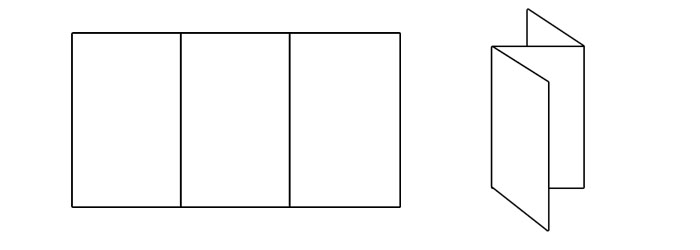
Tri-Fold
A tri-fold brochure is created by folding the paper into thirds and then tucking the right panel inside. It has six evenly-sized panels: three on the front, three on the back. This is another one of the most common brochures. It’s low-cost, compact and easy to carry, and offers enough space to include a lot of information.
While the number of panels and the panel sizes are the same as z-fold brochures, a tri-fold brochure offers a sense of timing: one panel is revealed after another.

Gate Fold
With a gate-fold brochure, the panels fold out from the center, like a two-door gate. They have a total of six panels (three front and three back), with the center panel being twice as large as the others. Gate folds work well with creative, graphic-heavy designs. The gate-style front panels can convey a sense of invitation to the reader.

French Fold (8-Panel Right Angle Fold)
The sheet of paper is folded in half in one direction, and then again in the opposite direction. A French fold brochure has a total of eight evenly-sized panels: four front, four back. This type of fold is well-suited for maps or any brochure involving large diagrams.

Coated vs. Uncoated Paper
The decision to use either coated or uncoated paper will affect the overall feel of your final product. What’s the difference between the two? Here are some of the basics.
Coated
Coated paper–as the name implies—has a coating applied to both sides. It provides a smooth finish, which will vary depending on the type of coating used. “High gloss” has a very shiny finish, while “matte” has a subtle shine.
Coated is the best choice for printing art, photos, magazines, and book covers because the ink doesn’t get absorbed but stays on top of the paper, resulting in brighter colors and a glossy finish.
Coating is more resistant to wear, dirt, water, etc. One thing to keep in mind is that it’s difficult to write on, so some people choose uncoated business cards for this reason.
Uncoated
Uncoated paper has a more natural feel to it. It offers an elegant, classic look and is often used for letterhead, stationary, restaurant menus, and college booklets.
More ink is absorbed and less light is reflected, making it the preferred choice for jobs with a lot of text, as it’s easier to read. It comes in various texture options.
Understanding Paper Weight
What do we mean by 120lb. cover business cards, and what does a paper’s weight refer to, exactly? Here are some of the basics to understanding different paper types.
* * *
Paper is measured in pounds per 500 sheets (one ream of paper) of a standard-size sheet of a particular paper grade.
A paper grade is a category of paper with its own uses and characteristics. The base ream is the size and quantity used to measure a particular paper grade, and the basis weight is the weight of a particular grade using its base ream measurements.
Some commonly used paper grades include cover, text, bond, and book.
Cover is a heavyweight paper stock most commonly used for business cards, postcards, invitations, and paperback book covers. It ranges from about 60-130lb.
base ream: 20x26”, 500 sheets
Text is a lightweight paper stock used for envelopes, resumes, and letterhead. It typically ranges from 60-100lb.
base ream: 25x38”, 500 sheets
Bond is an uncoated rigid stock commonly used in offices for letter heads, photo copies, and for laser printer paper. The standard weight is 20lb., but you may also see it offered as 16lb. or 24lb.
base ream: 17x22”, 500 sheets
Book paper is commonly used for posters, booklets, and catalogues. It may be coated or uncoated. It’s offered in as low as 30lb. (“bible stock,” a very thin paper mostly used for bibles) and as high as 115lb.
base ream: 25x38”, 500 sheets
Paper may also be measured in calipers, which refers to the thickness of a single sheet expressed in thousandths of an inch. So with 14pt. cardstock, for example, the paper is .014 inches thick.
14 Tips for Effective Poster Design
Posters are a great opportunity to draw attention, spread your message, and get creative. See below for some tips on getting the most mileage out of this effective marketing tool.
FONT
1. Keep it simple. Stick to one or two fonts to avoid clutter.
2. If you're using more than one font, try playing with contrast to draw attention — by using script next to a bold sans serif headline, for example.
3. Make sure your text is easy to read from a distance.
4. Match your font with your message: is it serious, playful, traditional, or modern?
Get more tips for choosing a font here.
IMAGE
5. Start with a single, dominant image to build your poster design around.
6. Be sure to use high-quality images for large posters, at least 300DPI.
MESSAGE
7. Less is more. Decide which elements are necessary and stick with those.
8. Include a call to action.
9. Establish a hierarchy of information with a headline, details, and fine print if necessary.
Composition
10. The eye is drawn to the center. You may want to consider placing your most important text here, or you can center your image and place the text in the header and footer.
11. Because the poster may be viewed from a distance, try using space between its elements.
Color
12. Create a mood and match your color to your message.
13. Draw attention with a colorful palette, or by focusing on just one or two hues.
Location
14. Consider where your poster will be located. This will affect your size, message, and even color (you don’t want it to blend into the environment).
Raster vs. Vector Graphics
Raster Graphics
Raster graphics are rendered as bitmaps, which are grids of hundreds of tiny pixels that collectively form an image. They display rich color detail and will be your best choice when working with photographs.
Raster graphics cannot be enlarged without losing quality and appearing blurry. This is because each is defined and displayed at a specific resolution, or DPI (you can learn more about this on our blog post here).
You can use Adobe Photoshop to create and edit raster files, which will typically have the extensions .jpeg, .psd, .png, .tiff, .bmp, or .gif.
Vector Graphics
Vector graphics are made up of geometric shapes such as points, lines, and curves. Mathematical formulas are used to fill in color along these paths. They’re best used for fonts and logo designs.
Because they’re not dependent on resolution, vector graphics can be scaled up or down without losing quality. They’ll also create smaller file sizes. Some possible downsides are that they display limited color details and cannot handle effects such as blurring, drop shadows, etc.
Vector graphics are created and edited in Adobe Photoshop and will produce files with the extensions .eps, .ai, and .pdf.
to summarize ...
Raster
Good for: photographs
Software: Adobe Photoshop
Files: .jpeg, .psd, .png, .tiff, .bmp, .gif
Pros: rich color detail
Cons: blurry when enlarged; large file sizes
Vector
Good for: fonts, logos
Software: Adobe Illustrator
Files: .eps, .ai, .pdf
Pros: can be scaled up or down without losing quality; smaller file sizes; editable
Cons: limited color detail; limited effects
What File Format Should You Use?
Ever wondered what’s the best file format to use when saving an image? The answer will be different depending on what your image is used for. Before we explain some common file types, here are some general file types and terms:
- If the images are for the web, you’ll typically want to use JPEG, PNG, or GIF.
- TIFF files create high-quality images that can be used for print.
- If you want to keep an editable version, use your software’s native format — .psd for Photoshop, .ai for Illustrator, etc. It’s helpful to have this to send to your designer or printer.
COMPRESSION: Lossless compression does not lose visual information. The quality of the image will remain the same no matter how many times the file is decompressed and recompressed.
Lossy compression loses visual information. The quality is reduced every time a file is decompressed and recompressed. The advantage of lossy compression techniques is that files can be made much smaller, which his helpful for sending files via email or posting them online.
File Types
JPEG — .jpg
JPEG may be the most commonly used and widely accepted image format, and it’s considered the standard for posting images online. It uses a lossy compression technique, resulting in small file sizes and fast load times. These files offer a good middle ground between quality and size.
GIF — .gif
GIF is another popular format used on the web. It uses lossless compression, and creates relatively small file sizes. However, it uses the 8-bit palette with only 256 colors (making JPEG the more popular choice). Unlike JPEGs, GIFs can use animation effects and support transparency.
PNG — .png
PNG was designed specifically for the web, and was intended as a replacement for the GIF. It uses a lossless compression technique, and saves color more efficiently than GIFs. While PNGs create larger file sizes than JPEGs, they support transparent (unlike GIFs). Because it uses RGB color rather than CMYK, it’s not the best choice for print.
TIFF — .tif
TIFF is a popular file type used in photo and page layout softwares (such as Photoshop, InDesign, and Quark). It creates very large file sizes and contains a lot of image data, with flexible color support for grayscale, CMYK, and RGB. It can be either lossless or lossy compression.
PDF is a universal file format developed by Adobe that can be opened by anyone with the free Adobe Reader software. PDFs can be saved as editable files, and they preserve all the fonts, layout, and both vector (lossless) and bitmap (lossy) graphics. They’re great for both digital and print. While the images aren’t embedded directly on websites, they can be offered as downloadable files.
Adobe Photoshop and Illustrator files – .PSD, .AI
A PSD is the native file format of Adobe Photoshop, and an AI file is the native format of Adobe Illustrator. They’re what you’ll use any time you’re working on an ongoing project in either program, and you should use these formats if you want to keep editable file versions. They use lossless compression.
4 Popular Print Finishes
In addition to the many cardstock options available, there are also a number of printing finishes you can add to your business cards and other print jobs. There are a variety of effects, which people use for different reasons: to add protection, to give their cards texture, or to draw attention. See below for some commonly used finishes.
Spot UV
Spot UV refers to a glossy coating applied only to some parts of the cardstock. People use this finish to add interest or draw the eye to specific places. A varnish is applied and then sealed with UV light, resulting in enhanced colors and a glossy final product. The coating also adds protection.
Foil Stamping
Foil stamping is malleable metallic material applied to certain elements of a card — often the text or logo. It will add a reflective surface to your card, helping it to stand out. The foil is often gold or silver, and many consider it to be a luxury finish.
Embossing
When something is embossed, parts of the page (such as images or text) are raised, creating texture and emphasis. This effect adds a tactile dimension to your card — you can actually feel the text and images.
Letterpress
Letterpress is sometimes referred to as “debossing,” or the opposite of embossing. Instead of raising certain parts of the card, letterpress indents text or images. Just like embossing, this finish creates a three-dimensional effect, producing shadows and highlights. (Letterpress and embossing can both get pretty pricey.)
These are just some of the basics to get you started. If you have any questions, or if you'd like to stop by our office to look at some samples and additional finishing options, get in touch.
Choosing a Cardstock
When you’re choosing paper for your business card, there are endless options available. Here are some of the basics you may want to know when choosing your cardstock.
First, “cardstock” is the proper term for the paper used for business cards. There are different thicknesses available, which is often measured in “points,” or the thickness of the sheet in thousand of an inch. For example, 13pt. card stock is 0.013 in. thick. It may also be measured in “grammage,” which describes the weight of the paper in grams per square meter.
Commonly used cardstocks for business cards include coated, uncoated, linen, laid, and silk laminated.
Coated
Coated cards have a glossy, shiny finish. They offer a polished, contemporary look. They feel firmer to the touch than an uncoated card, and provide greater protection from water damage and tearing.
Uncoated
Many people like the texture of uncoated cardstock. It has a traditional, elegant look, as these cards used to be the norm before digital printing and coating was introduced. Unlike coated cards, they’re easy to write on.
Linen
Linen cardstock has a subtle grid woven pattern, and is made to look like a linen cloth. It has very slightly lifted grooves, and its texture will leave both a visual and tactile impression.
Laid
Laid cardstock subtle, slightly lifted horizontal lines. It has a robust texture, and is similar to linen. Both the look and feel of the paper will help your card stand out.
Silk Laminated
Silk laminated cards have a soft, smooth finish that mimics the appearance of silk. They provide some extra durability, and are water- and tear-resistant. They have a sophisticated look, and the gloss is more subtle than standard coating. You may be familiar with it from product packaging, such as on boxes for Apple and Google products.
These are just some of the basics to get you started. If you have any questions, or if you'd like to stop by our office to look at some samples and additional finishing options, get in touch.
Understanding Resolution
When you send us a file to be printed, it’s helpful to understand proper resolution. Printed images require much higher resolutions than on-screen images, and it’s best to have the proper settings from the beginning — because while we can always make the image smaller, we cannot go up in size without losing quality. To achieve a crisp, clear, and detailed final product, here’s what you need to know.
important terms
The DPI is the number of dots in a printed inch. The larger the DPI number, the greater the resolution, which means you’ll be able to see more detail. Printers produce images with tiny dots that mix CMYK colors, and the more dots per inch — or the less space there is between these dots — the crisper your final product will be.
You may also see the term PPI used, which stands for “pixels per inch.” PPI typically refers to on-screen images, whereas DPI applies to printing, but some people use them interchangeably.
how to set your DPI
You can set your DPI by changing the “Resolution” number when creating a new file in Photoshop. 300DPI is the standard for most high-quality prints, and 150DPI is generally the minimum.
(While you’re here, make sure you’re using the proper color mode and that the canvas dimensions are not too small for your print job. As stated above, it’s hard to go up in size without losing quality, so a file for a poster print, for example, should not be 2x5”.)
web vs. print
Web images typically have smaller resolutions, in order to allow for faster load times. It’s not really necessary to have a high resolution for web — the quality looks fine at 72DPI, which is the standard. So basically, you may want to have two separate files for print and web that are optimized accordingly.
in conclusion...
Always keep in mind that digital and printed images differ in a number of ways. A detailed, high-quality on-screen image will not necessarily translate well to print. If the resolution is too small, the final product may appear blurry or pixelated.
Again, it’s best to use the proper settings from the beginning, when you first create your file. Contact us if you have any questions.
-
May 2023
- May 14, 2023 Branded Collateral, what you should know. May 14, 2023
-
July 2020
- Jul 14, 2020 Getting back to business After Covid-19 Jul 14, 2020
-
March 2017
- Mar 8, 2017 Postcard Marketing Ideas Mar 8, 2017
-
February 2017
- Feb 22, 2017 Actor Headshots: What You Should Know Feb 22, 2017
- Feb 10, 2017 The Emotional Effects of Print vs Digital Marketing Materials Feb 10, 2017
-
January 2017
- Jan 25, 2017 Letterhead Design Tips Jan 25, 2017
-
December 2016
- Dec 29, 2016 Brochure Design Tips Dec 29, 2016
-
November 2016
- Nov 3, 2016 How to Combine Fonts Nov 3, 2016
-
October 2016
- Oct 26, 2016 How to Create a Brand Style Guide Oct 26, 2016
-
September 2016
- Sep 21, 2016 Color Variations from Screen to Print Sep 21, 2016
- Sep 7, 2016 Why Business Cards Are Still Relevant Sep 7, 2016
-
August 2016
- Aug 24, 2016 5 Common Brochure Folds Aug 24, 2016
- Aug 11, 2016 Coated vs. Uncoated Paper Aug 11, 2016
-
July 2016
- Jul 20, 2016 Understanding Paper Weight Jul 20, 2016
- Jul 7, 2016 14 Tips for Effective Poster Design Jul 7, 2016
-
June 2016
- Jun 15, 2016 Raster vs. Vector Graphics Jun 15, 2016
- Jun 1, 2016 What File Format Should You Use? Jun 1, 2016
-
May 2016
- May 18, 2016 4 Popular Print Finishes May 18, 2016
- May 11, 2016 Choosing a Cardstock May 11, 2016
- May 5, 2016 Understanding Resolution May 5, 2016
-
April 2016
- Apr 21, 2016 Setting Up a Print Bleed Apr 21, 2016
- Apr 14, 2016 7 Tips for Choosing a Font Apr 14, 2016
- Apr 12, 2016 What Are Pantone Colors? Apr 12, 2016
- Apr 7, 2016 Designing Your Comp Card Apr 7, 2016
-
March 2016
- Mar 16, 2016 7 Tips for Designing Your Business Card Mar 16, 2016
- Mar 2, 2016 RGB vs. CMYK Mar 2, 2016
-
February 2016
- Feb 17, 2016 Offset vs. Digital Printing Feb 17, 2016