
Letterhead Design Tips
Use of customized letterhead is a great way to lend credibility to your business while reinforcing your brand identity. While much of our communication is now digital, a written or printed letter on letterhead will make an impression and show your clients or customers that you value their business. It’s a standard component of most corporate identity packages and in the business world, it’s often expected.
What is letterhead?
A letterhead is the heading at the top of a sheet of letter paper. It usually consists of a name, contact information, a logo or corporate design. The term “letterhead” is also often used to refer to the whole sheet of paper imprinted with that heading.
1. Keep it simple.
Your letterhead should support and showcase your content, not compete with it. It should frame the content of the letter without being too distracting.
Use a clean design: make use of white space, and don’t crowd the elements of your design. Prioritize your information — decide what’s essential. Keep your fonts to a minimum, and stick to one or two accent colors.
2. Create a visual hierarchy.
List your most critical information first. You can guide the eye by creating contrast with font size, styles and color, but don’t go overboard — too much style variation can get distracting. The most important thing is that your name and contact information are easy to read and find.
3. Pay attention to size.
Don’t make it so big that it’s distracting. However, you also don’t want your company and contact information to go unnoticed. Find the proper balance.
Keep your font size no smaller than 9 pts. Make sure it’s readable.
4. Consider visuals.

In addition to a logo, some companies include patterns or graphics as part of their letterpress. If your logo uses geometric shapes, you can try using some of these elements to create a pattern. Try to create a design that’s minimal and subtle.
To incorporate visuals to your design without using too much space, consider using a watermark.
5. Use quality paper.
Print your letterhead on quality paper stock with a professional feel. You may also want to consider special finishing options such as embossing, foil stamping or a full-bleed design.
How to Combine Fonts
Finding the right font can be a challenge in and of itself. Then there’s the challenge of finding another font or two that look nice with it. While there aren’t precise rules for combining fonts together, here are some best practices that can help you get started:
1. Create contrast.
Contrast between your fonts will highlight the different roles that your fonts are playing, as well as draw attention to important pieces of information. Furthermore, contrasting fonts tend to look nice together.
You can achieve contrast through differences in size, style and weight, or by pairing a sans-serif font with a serif font. Sans-serif/serif font pairings tend to work well together — it’s a popular, easy choice among designers.

2. Find a couple of shared characteristics.
While you do want contrast, you’ll also want to be sure that your fonts have a sense of harmony. Finding fonts with a couple shared characteristics will help you achieve this. For example, try combining fonts with similar x-heights, proportions or spacing.

PT Serif and PT Sans have similar x-heights. Fonts from the same family / creator typically have shared characteristics and pair well together.
3. Avoid pairing fonts that are too similar.
As you’re looking for shared characteristics between fonts, remember not to lose your sense of contrast. Your font choices should be distinct — it should be obvious that they are two different fonts, and that your choices were deliberate. Too many similarities may create confusion and discord.

There is not enough contrast between these fonts.
4. Pair complementary fonts.
Fonts have personalities: bold, light, playful, conservative, elegant, etc. If you’re using a bold font, for example, in your headings, try pairing it with an opposite, complementary body font — something more neutral.

5. Limit your number of fonts.
Best “font pairing” practices generally say to stick to 2-3 fonts. You can establish a visual hierarchy by assigning certain fonts to headings, subheadings, excepts and body text.

In general, you won't need more than three fonts (as used above).
How to Create a Brand Style Guide
A style guide is a reference sheet that defines the visual aspects of your brand, such as your logo, fonts and colors. It’s an essential tool for maintaining consistency throughout all of your branding materials, and is particularly helpful if you’re working with an outside designer or printer, or have multiple people creating new things for your brand. It can also help save time, so you’re never scrambling to find a new font or color to use.
Style guides (also referred to as "brand bibles") can get really in-depth and cover everything from your mission to your target audience, values and brand personality. Below we've outlined some of the more basic, visual design-related to include.
1. Your logo
Consider all the ways it might look in different places, and include multiple versions if necessary. For example, you might have different versions for your website homepage, business cards, letterheads, etc. You should also include any alternate color options you have (reversed, black and white, etc.).

WhatsApp offers several options of their logo to use for various layouts and occasions. (View the rest of their brand guidelines here.)
Specify the minimum size your logo should be displayed at, and whether it should be surrounded at a certain amount of empty space.

2. Your colors
This will typically be the colors from your logo, as well as a few complementary colors. This section should include HEX codes for web use, and CMYK values and Pantone colors for print. Conversions from RGB colors (using HEX codes) to CMYK can be dramatic sometimes, so be sure to test all of your colors. (Learn more about the differences between RGB, CMYK and Pantone colors.)

Coolors is a great, easy source for generating color schemes. You may also want to try Adobe Kuler and Paletton.
3. Your fonts
Specify which fonts go where — such as which fonts will be used for headings, subheadings, body text, etc. You can also specify sizes, weights, styles, etc.

from Mailchimp's style guide
4. imagery
Include any graphic or web elements and icons you might use. You might also want to describe what style of photography should be used, and if there are any visual elements that should be avoided.

Skype's style guide includes its own illustrations
Color Variations from Screen to Print
Ever wonder why the colors in your design look different when printed?

Colors typically appear brighter on your screen than they do when printed.
There are a lot of variables that affect the appearance of color. It’s important to understand that variations will arise from the different models used to create color:
- Monitors display color using the RGB color model, meaning they create color by mixing red, green, and blue. All monitors use RGB, but the display typically varies from screen to screen. It’s affected by the device’s graphics card, and also by its backlighting — whether it uses LED, LCD, or plasma.
Inkjet printers use the CMYK color model, producing color with cyan, magenta, yellow, and black. Again, colors often vary from printer to printer due to their settings.
Offset presses may use either CMYK or spot colors, which are created by mixing specific proportions of ink. The most popular spot colors are created by Pantone, which mixes 14 base colors. If you’re looking to get an exact color match, use Pantone. (This method can be a little pricey, though, and is not the best option for every job.)

These methods differ not only in the colors used, but in how they emit color. Monitors absorb light, while paper absorbs light. Because of the fundamental differences between monitors and print, if your goal is to achieve a certain color on a printed piece, the best thing you can do is print a sample. Make the necessary changes on your computer, and repeat until you get your desired results.
Related Posts:
RGB vs. CMYK
What Are Pantone Colors?
Offset vs. Digital Printing
14 Tips for Effective Poster Design
Posters are a great opportunity to draw attention, spread your message, and get creative. See below for some tips on getting the most mileage out of this effective marketing tool.
FONT
1. Keep it simple. Stick to one or two fonts to avoid clutter.
2. If you're using more than one font, try playing with contrast to draw attention — by using script next to a bold sans serif headline, for example.
3. Make sure your text is easy to read from a distance.
4. Match your font with your message: is it serious, playful, traditional, or modern?
Get more tips for choosing a font here.
IMAGE
5. Start with a single, dominant image to build your poster design around.
6. Be sure to use high-quality images for large posters, at least 300DPI.
MESSAGE
7. Less is more. Decide which elements are necessary and stick with those.
8. Include a call to action.
9. Establish a hierarchy of information with a headline, details, and fine print if necessary.
Composition
10. The eye is drawn to the center. You may want to consider placing your most important text here, or you can center your image and place the text in the header and footer.
11. Because the poster may be viewed from a distance, try using space between its elements.
Color
12. Create a mood and match your color to your message.
13. Draw attention with a colorful palette, or by focusing on just one or two hues.
Location
14. Consider where your poster will be located. This will affect your size, message, and even color (you don’t want it to blend into the environment).
Understanding Resolution
When you send us a file to be printed, it’s helpful to understand proper resolution. Printed images require much higher resolutions than on-screen images, and it’s best to have the proper settings from the beginning — because while we can always make the image smaller, we cannot go up in size without losing quality. To achieve a crisp, clear, and detailed final product, here’s what you need to know.
important terms
The DPI is the number of dots in a printed inch. The larger the DPI number, the greater the resolution, which means you’ll be able to see more detail. Printers produce images with tiny dots that mix CMYK colors, and the more dots per inch — or the less space there is between these dots — the crisper your final product will be.
You may also see the term PPI used, which stands for “pixels per inch.” PPI typically refers to on-screen images, whereas DPI applies to printing, but some people use them interchangeably.
how to set your DPI
You can set your DPI by changing the “Resolution” number when creating a new file in Photoshop. 300DPI is the standard for most high-quality prints, and 150DPI is generally the minimum.
(While you’re here, make sure you’re using the proper color mode and that the canvas dimensions are not too small for your print job. As stated above, it’s hard to go up in size without losing quality, so a file for a poster print, for example, should not be 2x5”.)
web vs. print
Web images typically have smaller resolutions, in order to allow for faster load times. It’s not really necessary to have a high resolution for web — the quality looks fine at 72DPI, which is the standard. So basically, you may want to have two separate files for print and web that are optimized accordingly.
in conclusion...
Always keep in mind that digital and printed images differ in a number of ways. A detailed, high-quality on-screen image will not necessarily translate well to print. If the resolution is too small, the final product may appear blurry or pixelated.
Again, it’s best to use the proper settings from the beginning, when you first create your file. Contact us if you have any questions.
Setting Up a Print Bleed
Whenever you’re creating a file to be printed, it’s important to include a bleed area in your design. A “bleed” allows us to account for any slight movement or mechanical variations when we’re cutting your cardstock. It serves as a buffer area, essentially.

In the image above, there's a safety line (the dotted line) and a cut line. Anything outside the safety line, in the bleed area, may get cut off during the trimming process. You should keep all of your important text and images inside the dotted lines.
To ensure that there are no unprinted edges in the final trimmed product, all background colors or artwork should extend past the cutline to fill the bleed area (the blue area in the above image). If you send us a file for your business card that has a background and you don’t include a bleed, this may potentially result in a white edge on your card.
A 1/4-inch bleed will give us sufficient room to work with. If you look at the image above, this includes everything from the dotted safety line through the blue bleed area. The cut line measures 3.5" x 2" (standard U.S. business card size); the bleed area extends 1/8 of an inch past the cut line, and the safety area is an additional 1/8 of an inch inside the cutline. Using these guidelines, the file you send us should be 3.75" x 2.25".
Adobe InDesign and Illustrator allow you to specify the bleed amount for each side when you set up a new file. For Photoshop, we recommend checking out this tutorial video or downloading our template below. If you'd like to see the safe area, trim line and bleed area as you're creating your design, download one of our templates below.
download:
7 Tips for Choosing a Font
The fonts you choose for your business cards, website, brochures, and other branding materials is important. The right font will elevate your message, while a poor font choice may lessen your credibility. Some are universally liked, and others are disliked by most. It’s not just about likability, though — there are other factors to keep in mind. Consider the points below.
1. What’s your brand personality? Is it serious, playful, traditional, or modern? Let your typeface (and all other components of your design) reflect the image you’re trying to convey.

2. Where will the text be displayed? Many fonts are not one-size-fits-all. Display typefaces are meant to be used in large formats. Text or body fonts are designed for use in large areas of copy.
3. Display faces should be used sparingly — in headlines, or occasionally to draw attention.

4. Try to stick with two fonts, or three at most. And don’t be afraid to use a single one for your entire brand.
5. If you’re only using one or two fonts, you’ll want them to be versatile. See how they look in different sizes, in bold, italic, capitals, lowercase, etc. Some are more versatile than others.

6. If you’re using more than one font, make sure they pair well together. You can do this by using fonts in the same family or by the same designer (for example, Merriweather and Merriweather Sans). It can also be helpful to find a shared quality, such as letter height or width. Experiment until you find the right match.

7. Don’t overcomplicate things. If you’re using more than one font, there should be a reason for it. Smashing Magazine explains: “If we reach a point where we want to add a second face to the mix, it’s always good to observe this simple rule: keep it exactly the same, or change it a lot — avoid wimpy, incremental variations.”
Still need help with design for your business cards or other branding materials? Contact us.
What Are Pantone Colors?
The Pantone Color Matching System (PMS) is the most widely used color reproduction system using in printing, digital technology, textiles, and other industries around the world. It enables designers, printers, and publishers to ensure accuracy and consistency in color matching. When working on a project, people in different locations can refer to a Pantone color by its name. This way, everyone will be on the same page, which will help you avoid reprints. This system has become particularly important as we’ve moved to digital, since computer monitor settings often vary.
History
Pantone was started as a commercial printing company in the 1950s. When Lawrence Herbert joined the company, he realized how difficult it was for people to communicate and reproduce colors and decided to use his chemistry knowledge to develop a solution. Herbert bought Pantone in 1962 and the following year, he launched the first PMS swatch book with just 10 colors. The company has since expanded and is on an “unwavering quest to become the universal language of color.” In addition to its widely popular Color of the Year, Pantone does trend forecasting, licensing, and color consulting.
How It Works
Pantone sells swatch guides, or chip books, that display colors on coated, uncoated, and matte stock, which will affect how the ink looks when printed. Each color has corresponding numbers, which identity the color itself, and a suffix to indicate the type of stock. You can also find the colors on their website, although they will look different on a monitor than they will when printed. To help you achieve the closest match, the Pantone website also offers color values for RGB, HEX/HTML, and CMYK. (RGB and HTML are used on monitors; CMYK is used in printing. Check out our blog post to learn more.)
Some Pantone colors can be recreated by mixing CMYK colors, while others require pre-mixed inks, which are referred to as “spot colors.” Printers can order these spot colors (they’re mixed by manufacturers licensed by Pantone) or mix the colors themselves using the ink mixing formulas in the Pantone Formula Guide.
If you’re looking to get the closest color match, using Pantone mixed ink will be your best bet. To do this, you’ll need to use offset printing rather than digital (learn about these two printing methods here), which uses CMYK colors. However, if using Pantone ink is not option (it may be more expensive), the Pantone Formula Guide provides values for CMYK, as well as a preview of what it will look like. Spot colors are created by mixing up to 18 different inks, as opposed to the four used in the CMYK process, so the spot colors may appear brighter and more vivid.
Still have questions about what to use for your prints? Contact us.
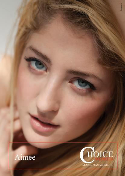
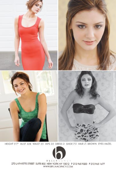
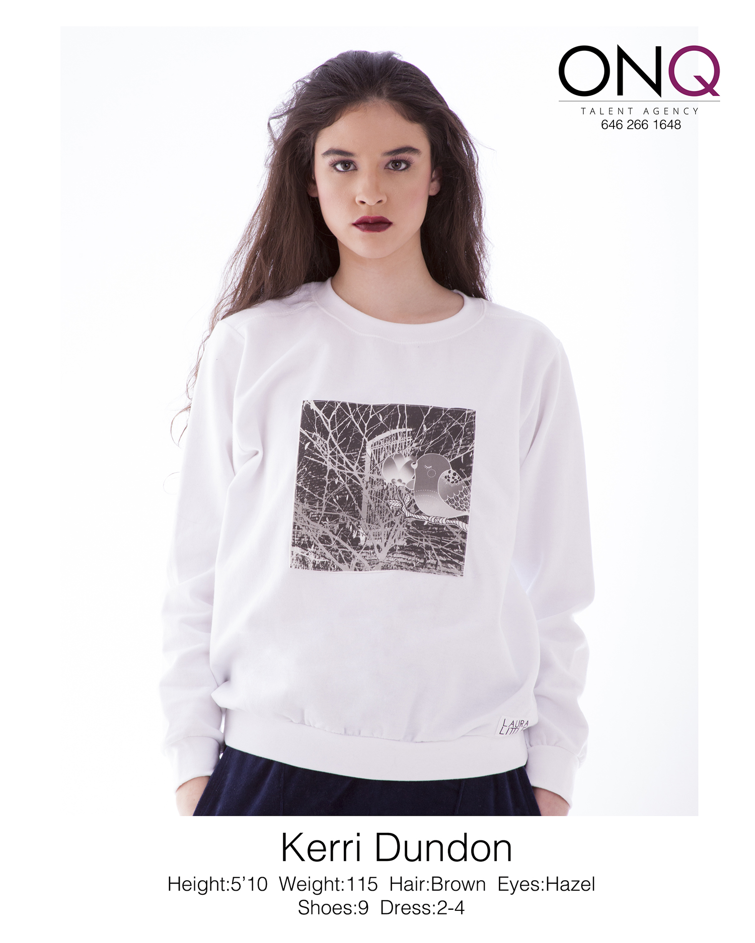
Designing Your Comp Card
Comp cards are the business cards of models and actors. They display a headshot on the front with an additional 3-5 images on back, along with the individual’s stats. They’re handed out to potential clients and agencies during auditions and castings, and they’re also used by agencies to market their models. “Comp card” is short for composite card, and it may also be referred to as a Sed Card, Zed Card, or Z Card (they all mean the same thing).

What you should know:
- Cards are typically 5.5” x 8.5”.
- They should be printed on quality, heavy cardstock.
Front of card:
- Show off your best headshot. To allow agents and potential clients to consider you for a variety of jobs, this headshot should ideally display a versatile, more “natural” look.
- Include your name, printed in a simple, easy-to-use font, such as Arial or Times New Roman, in size 12 or 14.
Back of card:
- Include three to five images that show variety. Ideally, they will convey your experience, range, and the type of work you’re seeking. If you’re a model, you’ll want to include a variety of looks. Actors may show different types of lifestyle shots, especially if they’re looking for commercial work.
- Most women include these stats: hair color, eye color, bust, waist, hips, dress size, and shoe size.
- Men typically include: hair color, eye color, height, suit or chest size, was it, inseam, and shoe size.
- Provide contact information: your cell phone number, email address, and possibly your website. Again, use a simple font, size 12-14.
- You may also display your agency's logo.
- The card may be vertical or horizontal.
These cards are your first impression, and a great marketing tool. Be sure to convey your professionalism with high-quality photos, a clean design, and quality printing production.
If you have any more questions about design, or you need comp cards printed, contact us. You can check out our pricing for card prints here.
7 Tips for Designing Your Business Card
Business cards are an opportunity to lend credibility. It might be the first item people receive from you, and you have a quick chance to make a good impression. We’ve put together some tips for an effective design. (Keep in mind that these are only suggestions, not hard rules.)
1. KEEP IT CLEAN AND CLUTTER-FREE.
Simple is better. Don’t be afraid to make use of white space. Important information should be easy to spot at a quick glance. Someone should immediately be able to find out whose card it as and what company it’s for.
2. KEEP IT READABLE.
Choose fonts and colors that are easy to read. Don’t make the text too small. It should be at least 8 pt. — anything smaller may look fine on your monitor, but it can appear fuzzy when printed.
3. BE THOUGHTFUL ABOUT WHAT INFORMATION TO INCLUDE.
Again, you don’t want clutter. Generally, the most important things to include are: your name, your job title, company name, phone number, and email. If you have room, include your website. Physical addresses are less important on cards these days so if you’re short on space, don’t worry about leaving this out.
Use the front of your card for your most important information. The back of the card can be an opportunity for extra branding — a statement, tagline, image, etc. Don’t include any messages that might be temporary.
4. THINK ABOUT COLOR.
Bold, bright colors can help you stand out. You also can’t go wrong with a black and white for a striking, professional look.
If you need help choosing colors, COLOURlovers.com is a helpful source where people can create palettes and users vote on them.
5. CONSIDER YOUR CARD'S PRACTICALITY.
The standard business card size 3.5”x2” (55x85mm). Some people like to use a different size to stand out. Keep in mind that if you choose to do this, your card won’t fit in standard holders.
6. BE CONSISTENT.
Try to choose a design that matches your website and other marketing materials (just make sure the fonts and colors are readable). Let it reflect your brand identity.
7. THINK OF YOUR BUSINESS CARD AS A MARKETING TOOL.
In addition to being a tool for distributing your contact information, it can also be a marketing opportunity. Think about what your goals are. Do you want to stand out? Try thick cardstock, a unique design, and unexpected colors. Or you can use a sleek, minimalistic design that conveys your professionalism.
Still not sure where to start? If you need help with your design, let us know.
RGB vs. CMYK
You may have heard about two of the main color modes used in design: RGB and CMYK. What do these mean? The easiest, and perhaps most important, thing to remember is that anything produced for the web should use the RGB color model, and anything made for print uses CMYK mode.
Computer monitors emit color as Red, Green, and Blue light, and use a mixing technology to produce other colors. Paper, on the other hand, absorbs or reflects light, so a different mixing system must be used for printing. Printers mix Cyan, Magenta, Yellow, and Key (Black) ink. These serve as filters, essentially, and subtract varying degrees of red, green, and blue from white light to produce other colors.
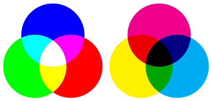
RGB (left) vs. CMYK (right)
Both RGB and CMYK can produce almost any color, but the mixing processes are very different. This should be taken into consideration when choosing a mode in an editing program such as Photoshop. Printers will accept RGB files, but you might not end up with the color you expected.
When more light is added in RGB, it produces brighter colors, whereas adding more ink in CMYK results in darker hues. So if you achieved very vibrant colors in RGB (by adding light), this may result in a dull final product when printed. If you want more control over your printed design, it’s best to first convert the file to CMYK.
-
May 2023
- May 14, 2023 Branded Collateral, what you should know. May 14, 2023
-
July 2020
- Jul 14, 2020 Getting back to business After Covid-19 Jul 14, 2020
-
March 2017
- Mar 8, 2017 Postcard Marketing Ideas Mar 8, 2017
-
February 2017
- Feb 22, 2017 Actor Headshots: What You Should Know Feb 22, 2017
- Feb 10, 2017 The Emotional Effects of Print vs Digital Marketing Materials Feb 10, 2017
-
January 2017
- Jan 25, 2017 Letterhead Design Tips Jan 25, 2017
-
December 2016
- Dec 29, 2016 Brochure Design Tips Dec 29, 2016
-
November 2016
- Nov 3, 2016 How to Combine Fonts Nov 3, 2016
-
October 2016
- Oct 26, 2016 How to Create a Brand Style Guide Oct 26, 2016
-
September 2016
- Sep 21, 2016 Color Variations from Screen to Print Sep 21, 2016
- Sep 7, 2016 Why Business Cards Are Still Relevant Sep 7, 2016
-
August 2016
- Aug 24, 2016 5 Common Brochure Folds Aug 24, 2016
- Aug 11, 2016 Coated vs. Uncoated Paper Aug 11, 2016
-
July 2016
- Jul 20, 2016 Understanding Paper Weight Jul 20, 2016
- Jul 7, 2016 14 Tips for Effective Poster Design Jul 7, 2016
-
June 2016
- Jun 15, 2016 Raster vs. Vector Graphics Jun 15, 2016
- Jun 1, 2016 What File Format Should You Use? Jun 1, 2016
-
May 2016
- May 18, 2016 4 Popular Print Finishes May 18, 2016
- May 11, 2016 Choosing a Cardstock May 11, 2016
- May 5, 2016 Understanding Resolution May 5, 2016
-
April 2016
- Apr 21, 2016 Setting Up a Print Bleed Apr 21, 2016
- Apr 14, 2016 7 Tips for Choosing a Font Apr 14, 2016
- Apr 12, 2016 What Are Pantone Colors? Apr 12, 2016
- Apr 7, 2016 Designing Your Comp Card Apr 7, 2016
-
March 2016
- Mar 16, 2016 7 Tips for Designing Your Business Card Mar 16, 2016
- Mar 2, 2016 RGB vs. CMYK Mar 2, 2016
-
February 2016
- Feb 17, 2016 Offset vs. Digital Printing Feb 17, 2016