web vs. print

Understanding Resolution

When you send us a file to be printed, it’s helpful to understand proper resolution. Printed images require much higher resolutions than on-screen images, and it’s best to have the proper settings from the beginning — because while we can always make the image smaller, we cannot go up in size without losing quality. To achieve a crisp, clear, and detailed final product, here’s what you need to know.

important terms

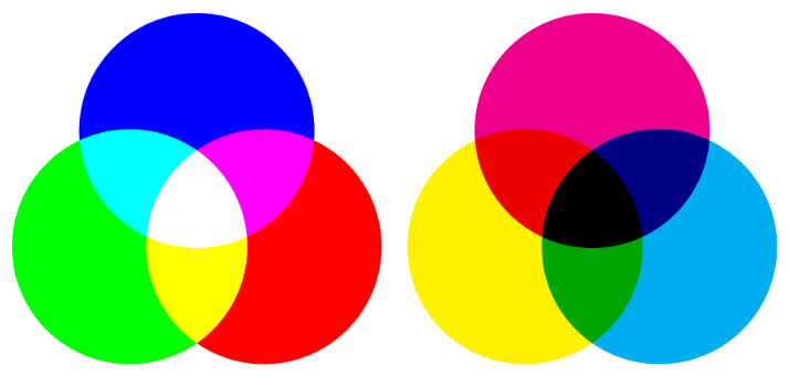
The DPI is the number of dots in a printed inch. The larger the DPI number, the greater the resolution, which means you’ll be able to see more detail. Printers produce images with tiny dots that mix CMYK colors, and the more dots per inch — or the less space there is between these dots — the crisper your final product will be.

You may also see the term PPI used, which stands for “pixels per inch.” PPI typically refers to on-screen images, whereas DPI applies to printing, but some people use them interchangeably.

how to set your DPI

You can set your DPI by changing the “Resolution” number when creating a new file in Photoshop. 300DPI is the standard for most high-quality prints, and 150DPI is generally the minimum.

(While you’re here, make sure you’re using the proper color mode and that the canvas dimensions are not too small for your print job. As stated above, it’s hard to go up in size without losing quality, so a file for a poster print, for example, should not be 2x5”.)

web vs. print

Web images typically have smaller resolutions, in order to allow for faster load times. It’s not really necessary to have a high resolution for web — the quality looks fine at 72DPI, which is the standard. So basically, you may want to have two separate files for print and web that are optimized accordingly.

in conclusion...

Always keep in mind that digital and printed images differ in a number of ways. A detailed, high-quality on-screen image will not necessarily translate well to print. If the resolution is too small, the final product may appear blurry or pixelated.

Again, it’s best to use the proper settings from the beginning, when you first create your file. Contact us if you have any questions.

Setting Up a Print Bleed

Whenever you’re creating a file to be printed, it’s important to include a bleed area in your design. A “bleed” allows us to account for any slight movement or mechanical variations when we’re cutting your cardstock. It serves as a buffer area, essentially. 

bleed and cut line guide for printing 

In the image above, there's a safety line (the dotted line) and a cut line. Anything outside the safety line, in the bleed area, may get cut off during the trimming process. You should keep all of your important text and images inside the dotted lines.

To ensure that there are no unprinted edges in the final trimmed product, all background colors or artwork should extend past the cutline to fill the bleed area (the blue area in the above image). If you send us a file for your business card that has a background and you don’t include a bleed, this may potentially result in a white edge on your card.

A 1/4-inch bleed will give us sufficient room to work with. If you look at the image above, this includes everything from the dotted safety line through the blue bleed area. The cut line measures 3.5" x 2" (standard U.S. business card size); the bleed area extends 1/8 of an inch past the cut line, and the safety area is an additional 1/8 of an inch inside the cutline. Using these guidelines, the file you send us should be 3.75" x 2.25".

Adobe InDesign and Illustrator allow you to specify the bleed amount for each side when you set up a new file. For Photoshop, we recommend checking out this tutorial video or downloading our template below. If you'd like to see the safe area, trim line and bleed area as you're creating your design, download one of our templates below.

download:

What Are Pantone Colors?

The Pantone Color Matching System (PMS) is the most widely used color reproduction system using in printing, digital technology, textiles, and other industries around the world. It enables designers, printers, and publishers to ensure accuracy and consistency in color matching. When working on a project, people in different locations can refer to a Pantone color by its name. This way, everyone will be on the same page, which will help you avoid reprints. This system has become particularly important as we’ve moved to digital, since computer monitor settings often vary.

History

Pantone was started as a commercial printing company in the 1950s. When Lawrence Herbert joined the company, he realized how difficult it was for people to communicate and reproduce colors and decided to use his chemistry knowledge to develop a solution. Herbert bought Pantone in 1962 and the following year, he launched the first PMS swatch book with just 10 colors. The company has since expanded and is on an “unwavering quest to become the universal language of color.” In addition to its widely popular Color of the Year, Pantone does trend forecasting, licensing, and color consulting.

How It Works

Pantone sells swatch guides, or chip books, that display colors on coated, uncoated, and matte stock, which will affect how the ink looks when printed. Each color has corresponding numbers, which identity the color itself, and a suffix to indicate the type of stock. You can also find the colors on their website, although they will look different on a monitor than they will when printed. To help you achieve the closest match, the Pantone website also offers color values for RGB, HEX/HTML, and CMYK. (RGB and HTML are used on monitors; CMYK is used in printing. Check out our blog post to learn more.)

Some Pantone colors can be recreated by mixing CMYK colors, while others require pre-mixed inks, which are referred to as “spot colors.” Printers can order these spot colors (they’re mixed by manufacturers licensed by Pantone) or mix the colors themselves using the ink mixing formulas in the Pantone Formula Guide.

If you’re looking to get the closest color match, using Pantone mixed ink will be your best bet. To do this, you’ll need to use offset printing rather than digital (learn about these two printing methods here), which uses CMYK colors. However, if using Pantone ink is not option (it may be more expensive), the Pantone Formula Guide provides values for CMYK, as well as a preview of what it will look like. Spot colors are created by mixing up to 18 different inks, as opposed to the four used in the CMYK process, so the spot colors may appear brighter and more vivid.

Still have questions about what to use for your prints? Contact us.

RGB vs. CMYK

You may have heard about two of the main color modes used in design: RGB and CMYK. What do these mean? The easiest, and perhaps most important, thing to remember is that anything produced for the web should use the RGB color model, and anything made for print uses CMYK mode.

Computer monitors emit color as Red, Green, and Blue light, and use a mixing technology to produce other colors. Paper, on the other hand, absorbs or reflects light, so a different mixing system must be used for printing. Printers mix Cyan, Magenta, Yellow, and Key (Black) ink. These serve as filters, essentially, and subtract varying degrees of red, green, and blue from white light to produce other colors.

RGB (left) vs. CMYK (right)

RGB (left) vs. CMYK (right)

Both RGB and CMYK can produce almost any color, but the mixing processes are very different. This should be taken into consideration when choosing a mode in an editing program such as Photoshop. Printers will accept RGB files, but you might not end up with the color you expected.

When more light is added in RGB, it produces brighter colors, whereas adding more ink in CMYK results in darker hues. So if you achieved very vibrant colors in RGB (by adding light), this may result in a dull final product when printed. If you want more control over your printed design, it’s best to first convert the file to CMYK.

Offset vs. Digital Printing

Offset and digital are the two most common printing technologies, and the question is often asked, “Which is better?” There’s no real answer to that, because the best choice of printing methods depends on several factors specific to each job. Here’s what you need to know.

How They Work

Offset printing works by applying layers of ink to paper (or another surface) using a series of rollers. Ink is transferred from a plate to a rubber sheet, which is then used to roll the ink onto paper. Each roller has its own ink, which can be CMYK (cyan, magenta, yellow, and black) or Pantone colors.

Digital printing does not use plates. Most digital presses apply ink to paper in a single step, from one ink head — similar to the inkjet printers found in many homes and offices. Digital printing uses a four-color matching process, mixing CMYK colors.

The Finished Products

The end results for offset and digital printing are very similar. The untrained eye won’t tell the difference. Some say that offset printing has a slightly better quality, but this is becoming debatable as digital printing technology is improving. There are some more options available with offset printing, such as heavier cardstock and special finishes.

Offset printing uses actual Pantone ink, so if you’re using Pantone colors, this will give you the best match. However, digital printing can simulate Pantone using its four-color matching process.

Because there is little visual variation, the main differences with these two printing methods really come down to setup, maintenance, cost, and time.

Which Method is Best for You?

The most important factors to consider are the price, quantities, and time requirements of each job.

Offset printing is less expensive — but only if you’re printing large quantities, because there’s setup involved. Every job must be made into a plate, and the press must be set up individually for each job. Once the process is started, however, offset presses can print very quickly, which helps lower the overall cost. The larger the print job, the lower the price per piece.

Digital is your best choice for printing small quantities (generally less than 500 units). Because digital printing doesn’t use plates, the cost can be calculated per printed piece. It’s also the best method for rush jobs – again, because there’s no setup.

Still unsure which type is right for you? Contact us — we're happy to help.