
Brochure Design Tips
A well-designed brochure can be a highly effective marketing tool. Brochures allow you to communicate a lot of information in a small printed piece that's easy for potential clients to carry with them. Here are some tips for making the most of that space:
1. Emphasize your call to action.
Have a specific goal in mind from the beginning, and let that be the guide for your content and design choices. Do you want people to visit your website? Call you? Visit your location? While you might think these things are implied, your call-to-action should be spelled out and emphasized.

This company's goal is to get people to contact them. Their call to action is emphasized on the back panel.
2. Sketch and fold your design.
Take a piece of paper, fold it into thirds and start sketching out your content. This step is helpful in planning how you will organize the different components of your brochure, as it allows you to visualize the order in which your content will be read.
- The front panel should invite your reader to open the brochure.
- The inner front panel will usually include small amounts of information that further interests the reader, such as customer benefits or a summary of your services.
- Keep in mind that the far right inside panel will be the last to be read and is sometimes overlooked, so avoid placing critical information here.
- The back panel is typically reserved for your location, contact information, website and social links.

This brochure follows the format described above. The front panel has a bold image and text that invite the reader to open the brochure; the inner front panel includes a summary and brief list to further interest the reader to learn more about Marcus' photography; and the back panel includes a location and contact information, as well as a call to action ("RSVP").
3. Include visuals.
Create a visually appealing brochure by including relevant photos and artwork where applicable. Pictures will help draw attention and break up blocks of text, making it easier for your brochure to scan.
You should also use charts and graphs to summarize your data whenever possible (people are more likely to remember information this way). You can use simple charts or graphs to compare your different products or services, or to compare your company’s benefits to those of your competitors. You might also use pie charts, visual timelines, etc.

The graphics in this brochure help break up the text and make it easy to scan — each gives an idea of what the section is about.
4. Keep it concise.
Use your space wisely, and avoid cramming in too much information. Your brochure should be easy and enjoyable to read, and also possible to scan.
With limited space, it’s not necessary to list your company’s history and all your achievements — you only need the basic details. Instead, focus on the reader, and your company’s benefits. How will the reader benefit from your product or services?
All of your content should be designed to spark interest and support your call-to-action.

This brochure clearly and concisely states the company's benefits.
5 Common Brochure Folds
Bi-Fold (Half-Fold)
A bi-fold brochure is simply folded in half, either vertically or horizontally, to create four panels. This simple, low-cost fold is one of the most commonly-used brochure types.

Z-Fold (Accordion)
To create a z-fold brochure, the paper is folded in thirds, accordion-style, and opens in the shape of a “z.” It has six evenly-sized panels: three on the front and three on the back. It’s compact and can include a lot of content. This type of fold is often used for “quick glance” brochures.
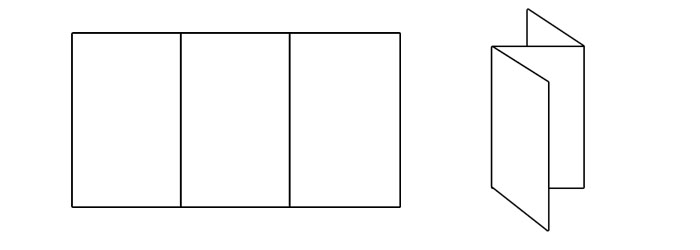
Tri-Fold
A tri-fold brochure is created by folding the paper into thirds and then tucking the right panel inside. It has six evenly-sized panels: three on the front, three on the back. This is another one of the most common brochures. It’s low-cost, compact and easy to carry, and offers enough space to include a lot of information.
While the number of panels and the panel sizes are the same as z-fold brochures, a tri-fold brochure offers a sense of timing: one panel is revealed after another.

Gate Fold
With a gate-fold brochure, the panels fold out from the center, like a two-door gate. They have a total of six panels (three front and three back), with the center panel being twice as large as the others. Gate folds work well with creative, graphic-heavy designs. The gate-style front panels can convey a sense of invitation to the reader.

French Fold (8-Panel Right Angle Fold)
The sheet of paper is folded in half in one direction, and then again in the opposite direction. A French fold brochure has a total of eight evenly-sized panels: four front, four back. This type of fold is well-suited for maps or any brochure involving large diagrams.

-
May 2023
- May 14, 2023 Branded Collateral, what you should know. May 14, 2023
-
July 2020
- Jul 14, 2020 Getting back to business After Covid-19 Jul 14, 2020
-
March 2017
- Mar 8, 2017 Postcard Marketing Ideas Mar 8, 2017
-
February 2017
- Feb 22, 2017 Actor Headshots: What You Should Know Feb 22, 2017
- Feb 10, 2017 The Emotional Effects of Print vs Digital Marketing Materials Feb 10, 2017
-
January 2017
- Jan 25, 2017 Letterhead Design Tips Jan 25, 2017
-
December 2016
- Dec 29, 2016 Brochure Design Tips Dec 29, 2016
-
November 2016
- Nov 3, 2016 How to Combine Fonts Nov 3, 2016
-
October 2016
- Oct 26, 2016 How to Create a Brand Style Guide Oct 26, 2016
-
September 2016
- Sep 21, 2016 Color Variations from Screen to Print Sep 21, 2016
- Sep 7, 2016 Why Business Cards Are Still Relevant Sep 7, 2016
-
August 2016
- Aug 24, 2016 5 Common Brochure Folds Aug 24, 2016
- Aug 11, 2016 Coated vs. Uncoated Paper Aug 11, 2016
-
July 2016
- Jul 20, 2016 Understanding Paper Weight Jul 20, 2016
- Jul 7, 2016 14 Tips for Effective Poster Design Jul 7, 2016
-
June 2016
- Jun 15, 2016 Raster vs. Vector Graphics Jun 15, 2016
- Jun 1, 2016 What File Format Should You Use? Jun 1, 2016
-
May 2016
- May 18, 2016 4 Popular Print Finishes May 18, 2016
- May 11, 2016 Choosing a Cardstock May 11, 2016
- May 5, 2016 Understanding Resolution May 5, 2016
-
April 2016
- Apr 21, 2016 Setting Up a Print Bleed Apr 21, 2016
- Apr 14, 2016 7 Tips for Choosing a Font Apr 14, 2016
- Apr 12, 2016 What Are Pantone Colors? Apr 12, 2016
- Apr 7, 2016 Designing Your Comp Card Apr 7, 2016
-
March 2016
- Mar 16, 2016 7 Tips for Designing Your Business Card Mar 16, 2016
- Mar 2, 2016 RGB vs. CMYK Mar 2, 2016
-
February 2016
- Feb 17, 2016 Offset vs. Digital Printing Feb 17, 2016