color

Color Variations from Screen to Print

Ever wonder why the colors in your design look different when printed?

Colors typically appear brighter on your screen than they do when printed.

Colors typically appear brighter on your screen than they do when printed.

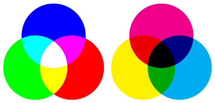
There are a lot of variables that affect the appearance of color. It’s important to understand that variations will arise from the different models used to create color: 

  • Monitors display color using the RGB color model, meaning they create color by mixing red, green, and blue. All monitors use RGB, but the display typically varies from screen to screen. It’s affected by the device’s graphics card, and also by its backlighting — whether it uses LED, LCD, or plasma.
  • Inkjet printers use the CMYK color model, producing color with cyan, magenta, yellow, and black. Again, colors often vary from printer to printer due to their settings.

  • Offset presses may use either CMYK or spot colors, which are created by mixing specific proportions of ink. The most popular spot colors are created by Pantone, which mixes 14 base colors. If you’re looking to get an exact color match, use Pantone. (This method can be a little pricey, though, and is not the best option for every job.)

shades of red

These methods differ not only in the colors used, but in how they emit color. Monitors absorb light, while paper absorbs light. Because of the fundamental differences between monitors and print, if your goal is to achieve a certain color on a printed piece, the best thing you can do is print a sample. Make the necessary changes on your computer, and repeat until you get your desired results.

Related Posts:
RGB vs. CMYK
What Are Pantone Colors?
Offset vs. Digital Printing

What Are Pantone Colors?

The Pantone Color Matching System (PMS) is the most widely used color reproduction system using in printing, digital technology, textiles, and other industries around the world. It enables designers, printers, and publishers to ensure accuracy and consistency in color matching. When working on a project, people in different locations can refer to a Pantone color by its name. This way, everyone will be on the same page, which will help you avoid reprints. This system has become particularly important as we’ve moved to digital, since computer monitor settings often vary.

History

Pantone was started as a commercial printing company in the 1950s. When Lawrence Herbert joined the company, he realized how difficult it was for people to communicate and reproduce colors and decided to use his chemistry knowledge to develop a solution. Herbert bought Pantone in 1962 and the following year, he launched the first PMS swatch book with just 10 colors. The company has since expanded and is on an “unwavering quest to become the universal language of color.” In addition to its widely popular Color of the Year, Pantone does trend forecasting, licensing, and color consulting.

How It Works

Pantone sells swatch guides, or chip books, that display colors on coated, uncoated, and matte stock, which will affect how the ink looks when printed. Each color has corresponding numbers, which identity the color itself, and a suffix to indicate the type of stock. You can also find the colors on their website, although they will look different on a monitor than they will when printed. To help you achieve the closest match, the Pantone website also offers color values for RGB, HEX/HTML, and CMYK. (RGB and HTML are used on monitors; CMYK is used in printing. Check out our blog post to learn more.)

Some Pantone colors can be recreated by mixing CMYK colors, while others require pre-mixed inks, which are referred to as “spot colors.” Printers can order these spot colors (they’re mixed by manufacturers licensed by Pantone) or mix the colors themselves using the ink mixing formulas in the Pantone Formula Guide.

If you’re looking to get the closest color match, using Pantone mixed ink will be your best bet. To do this, you’ll need to use offset printing rather than digital (learn about these two printing methods here), which uses CMYK colors. However, if using Pantone ink is not option (it may be more expensive), the Pantone Formula Guide provides values for CMYK, as well as a preview of what it will look like. Spot colors are created by mixing up to 18 different inks, as opposed to the four used in the CMYK process, so the spot colors may appear brighter and more vivid.

Still have questions about what to use for your prints? Contact us.

RGB vs. CMYK

You may have heard about two of the main color modes used in design: RGB and CMYK. What do these mean? The easiest, and perhaps most important, thing to remember is that anything produced for the web should use the RGB color model, and anything made for print uses CMYK mode.

Computer monitors emit color as Red, Green, and Blue light, and use a mixing technology to produce other colors. Paper, on the other hand, absorbs or reflects light, so a different mixing system must be used for printing. Printers mix Cyan, Magenta, Yellow, and Key (Black) ink. These serve as filters, essentially, and subtract varying degrees of red, green, and blue from white light to produce other colors.

RGB (left) vs. CMYK (right)

RGB (left) vs. CMYK (right)

Both RGB and CMYK can produce almost any color, but the mixing processes are very different. This should be taken into consideration when choosing a mode in an editing program such as Photoshop. Printers will accept RGB files, but you might not end up with the color you expected.

When more light is added in RGB, it produces brighter colors, whereas adding more ink in CMYK results in darker hues. So if you achieved very vibrant colors in RGB (by adding light), this may result in a dull final product when printed. If you want more control over your printed design, it’s best to first convert the file to CMYK.