
Raster vs. Vector Graphics
Raster Graphics
Raster graphics are rendered as bitmaps, which are grids of hundreds of tiny pixels that collectively form an image. They display rich color detail and will be your best choice when working with photographs.
Raster graphics cannot be enlarged without losing quality and appearing blurry. This is because each is defined and displayed at a specific resolution, or DPI (you can learn more about this on our blog post here).
You can use Adobe Photoshop to create and edit raster files, which will typically have the extensions .jpeg, .psd, .png, .tiff, .bmp, or .gif.
Vector Graphics
Vector graphics are made up of geometric shapes such as points, lines, and curves. Mathematical formulas are used to fill in color along these paths. They’re best used for fonts and logo designs.
Because they’re not dependent on resolution, vector graphics can be scaled up or down without losing quality. They’ll also create smaller file sizes. Some possible downsides are that they display limited color details and cannot handle effects such as blurring, drop shadows, etc.
Vector graphics are created and edited in Adobe Photoshop and will produce files with the extensions .eps, .ai, and .pdf.
to summarize ...
Raster
Good for: photographs
Software: Adobe Photoshop
Files: .jpeg, .psd, .png, .tiff, .bmp, .gif
Pros: rich color detail
Cons: blurry when enlarged; large file sizes
Vector
Good for: fonts, logos
Software: Adobe Illustrator
Files: .eps, .ai, .pdf
Pros: can be scaled up or down without losing quality; smaller file sizes; editable
Cons: limited color detail; limited effects
Understanding Resolution
When you send us a file to be printed, it’s helpful to understand proper resolution. Printed images require much higher resolutions than on-screen images, and it’s best to have the proper settings from the beginning — because while we can always make the image smaller, we cannot go up in size without losing quality. To achieve a crisp, clear, and detailed final product, here’s what you need to know.
important terms
The DPI is the number of dots in a printed inch. The larger the DPI number, the greater the resolution, which means you’ll be able to see more detail. Printers produce images with tiny dots that mix CMYK colors, and the more dots per inch — or the less space there is between these dots — the crisper your final product will be.
You may also see the term PPI used, which stands for “pixels per inch.” PPI typically refers to on-screen images, whereas DPI applies to printing, but some people use them interchangeably.
how to set your DPI
You can set your DPI by changing the “Resolution” number when creating a new file in Photoshop. 300DPI is the standard for most high-quality prints, and 150DPI is generally the minimum.
(While you’re here, make sure you’re using the proper color mode and that the canvas dimensions are not too small for your print job. As stated above, it’s hard to go up in size without losing quality, so a file for a poster print, for example, should not be 2x5”.)
web vs. print
Web images typically have smaller resolutions, in order to allow for faster load times. It’s not really necessary to have a high resolution for web — the quality looks fine at 72DPI, which is the standard. So basically, you may want to have two separate files for print and web that are optimized accordingly.
in conclusion...
Always keep in mind that digital and printed images differ in a number of ways. A detailed, high-quality on-screen image will not necessarily translate well to print. If the resolution is too small, the final product may appear blurry or pixelated.
Again, it’s best to use the proper settings from the beginning, when you first create your file. Contact us if you have any questions.
RGB vs. CMYK
You may have heard about two of the main color modes used in design: RGB and CMYK. What do these mean? The easiest, and perhaps most important, thing to remember is that anything produced for the web should use the RGB color model, and anything made for print uses CMYK mode.
Computer monitors emit color as Red, Green, and Blue light, and use a mixing technology to produce other colors. Paper, on the other hand, absorbs or reflects light, so a different mixing system must be used for printing. Printers mix Cyan, Magenta, Yellow, and Key (Black) ink. These serve as filters, essentially, and subtract varying degrees of red, green, and blue from white light to produce other colors.
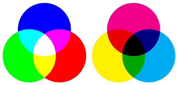
RGB (left) vs. CMYK (right)
Both RGB and CMYK can produce almost any color, but the mixing processes are very different. This should be taken into consideration when choosing a mode in an editing program such as Photoshop. Printers will accept RGB files, but you might not end up with the color you expected.
When more light is added in RGB, it produces brighter colors, whereas adding more ink in CMYK results in darker hues. So if you achieved very vibrant colors in RGB (by adding light), this may result in a dull final product when printed. If you want more control over your printed design, it’s best to first convert the file to CMYK.
-
May 2023
- May 14, 2023 Branded Collateral, what you should know. May 14, 2023
-
July 2020
- Jul 14, 2020 Getting back to business After Covid-19 Jul 14, 2020
-
March 2017
- Mar 8, 2017 Postcard Marketing Ideas Mar 8, 2017
-
February 2017
- Feb 22, 2017 Actor Headshots: What You Should Know Feb 22, 2017
- Feb 10, 2017 The Emotional Effects of Print vs Digital Marketing Materials Feb 10, 2017
-
January 2017
- Jan 25, 2017 Letterhead Design Tips Jan 25, 2017
-
December 2016
- Dec 29, 2016 Brochure Design Tips Dec 29, 2016
-
November 2016
- Nov 3, 2016 How to Combine Fonts Nov 3, 2016
-
October 2016
- Oct 26, 2016 How to Create a Brand Style Guide Oct 26, 2016
-
September 2016
- Sep 21, 2016 Color Variations from Screen to Print Sep 21, 2016
- Sep 7, 2016 Why Business Cards Are Still Relevant Sep 7, 2016
-
August 2016
- Aug 24, 2016 5 Common Brochure Folds Aug 24, 2016
- Aug 11, 2016 Coated vs. Uncoated Paper Aug 11, 2016
-
July 2016
- Jul 20, 2016 Understanding Paper Weight Jul 20, 2016
- Jul 7, 2016 14 Tips for Effective Poster Design Jul 7, 2016
-
June 2016
- Jun 15, 2016 Raster vs. Vector Graphics Jun 15, 2016
- Jun 1, 2016 What File Format Should You Use? Jun 1, 2016
-
May 2016
- May 18, 2016 4 Popular Print Finishes May 18, 2016
- May 11, 2016 Choosing a Cardstock May 11, 2016
- May 5, 2016 Understanding Resolution May 5, 2016
-
April 2016
- Apr 21, 2016 Setting Up a Print Bleed Apr 21, 2016
- Apr 14, 2016 7 Tips for Choosing a Font Apr 14, 2016
- Apr 12, 2016 What Are Pantone Colors? Apr 12, 2016
- Apr 7, 2016 Designing Your Comp Card Apr 7, 2016
-
March 2016
- Mar 16, 2016 7 Tips for Designing Your Business Card Mar 16, 2016
- Mar 2, 2016 RGB vs. CMYK Mar 2, 2016
-
February 2016
- Feb 17, 2016 Offset vs. Digital Printing Feb 17, 2016